Column Graphs Teaching Resources
Teach about column graphs in your classroom with printable worksheets, creating a column graph task cards and activities and more for teaching this maths concept in primary classrooms.
Explore editable resources you can easily differentiate for individual learners, plus engaging games to help students visually represent data.
This collection of Australian curriculum-aligned printable and digital resources has been created just for teachers by the teachers on the Teach Starter team. That means each resource has undergone an in-depth review before publication to ensure it's ready for the classroom and your lesson plans!
New to teaching this section of the maths curriculum? Read on for a guide to teaching column graphs from our teacher team!
What Are Column Graphs? A Kid-Friendly Definition
How do you explain what a column graph is when you're just diving in? Here's a simple definition for your students, plus definitions of some key vocabulary terms!
A column graph is a graph that uses bars or rectangles to represent data. Each bar in the graph represents a category or group, and the height or length of the bar represents the quantity or value of that category.
A column graph is also sometimes called a bar graph due to the bars that are used to represent the data.
Bar
If you have a bar graph, you have bars. But what's a bar? This is the rectangular shape that represents the quantity or value of a category. The height or length of the bar indicates the amount of data for that category.

Axis
The axis is a key term to learn as students start with graphing — it will come in handy as they move on to more complex maths! This is the line that runs along the bottom or side of the graph. It's used to label the different categories or groups represented in the graph.
Title
Just like the title of a book, the title is the name of the graph, which usually describes what the graph is showing or what question it is answering.
Column Graph Examples for Kids
Countless data sets can be represented on a column graph, so it only stands to reason that there are different types to represent data in different ways! Here are some of the common column graph examples that can be used:
Double Column Graph
A double column graph is a way to show two sets of data side by side and often used in maths classes for comparing two different sets of data directly. For example, a double bar graph might be used to compare the number of boys and girls in different year levels.
The bars of this type of graph are typically coloured differently or patterned to indicate the data set they represent.
Stacked Column Graph
Another common type of graph students will use is a stacked column graph. This is a type of bar graph where the bars are divided into segments, each representing a different part of the data being displayed.
In this graph, segments are stacked on top of each other to create a complete bar, with the height or length of each segment representing the quantity or value of that part of the data.
Stacked bar graphs show how different parts of the data contribute to the total value. For example, a stacked column graph could show the different types of expenses that make up a household budget.
Segmented Column Graph
Although stacked column graphs are segmented, they're not the same as segmented column graphs!
Each bar in a segmented graph is divided into segments that represent different sub-categories of the data being displayed, making them useful for showing how data is distributed within each category. For example, a segmented bar graph could be used to show the different types of animals in a zoo, with each bar representing a different section and each segment representing a different type of animal.
Each segment in this type of graph is coloured differently or patterned to make it clear which sub-category it represents.
- Plus Plan
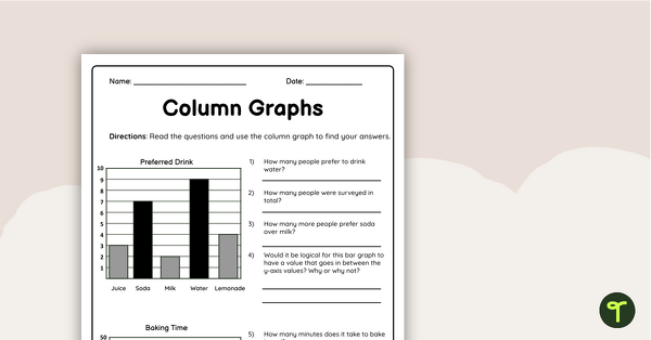
Column Graphs Grade 5 Worksheet
Use this double-sided column graphs worksheet to check your students’ understanding of interpreting and drawing column graphs.
- Plus Plan
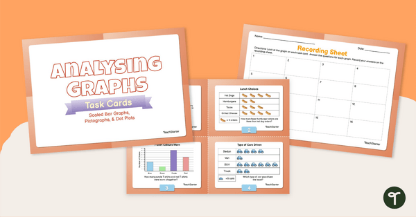
Analysing Graphs — Scaled Bar Graphs, Pictographs, & Dot Plots —Task Cards
Use data analysis skills to analyse scaled bar graphs, pictographs, and dot plots with this set of task cards.
- Plus Plan
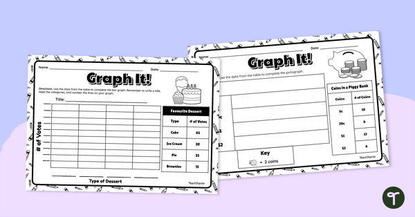
Graph It! Worksheet (Many-to-One Graphs)
Draw a scaled picture graph and bar graph to represent data with this worksheet.
- Free Plan
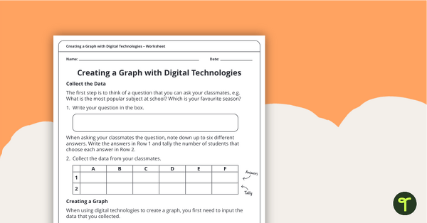
Creating a Graph Using Digital Technologies
A worksheet that supports students when collecting initial data and creating a digital graph.
- Plus Plan
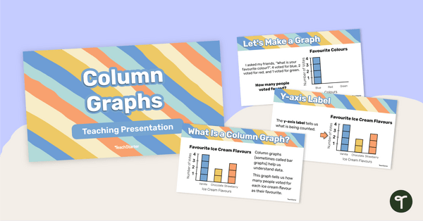
Column Graphs – Teaching Presentation
Learn all the features and how to construct a column graph with this 25-page teaching presentation.
- Plus Plan
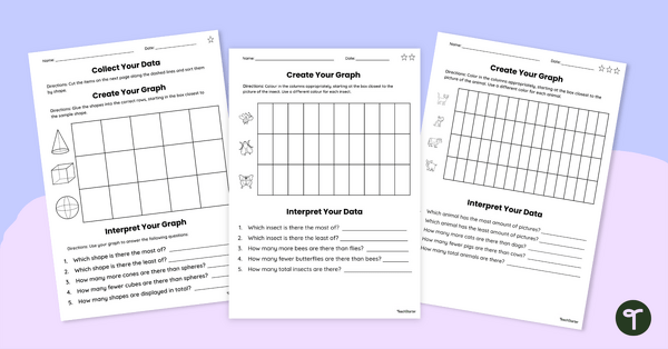
Data Collection Worksheet Set
Use this set of differentiated graphs worksheets to assess your students’ understanding of how data is collected, organised and presented.
- Plus Plan
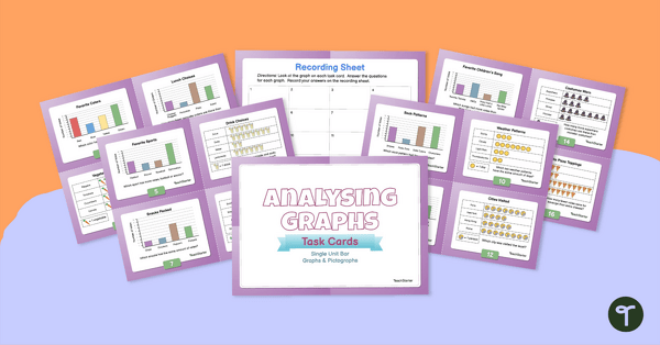
Analysing Graphs – Single-Unit Bar Graphs and Pictographs – Task Cards
Use data analysis skills to analyse bar graphs and pictographs with this set of task cards.
- Plus Plan
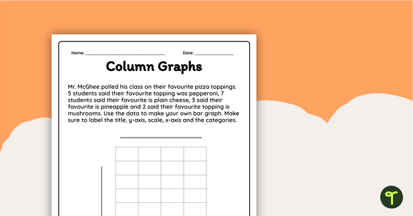
Creating a Bar Graph Worksheet
Interpret data and create a column graph display with this worksheet.
- Plus Plan
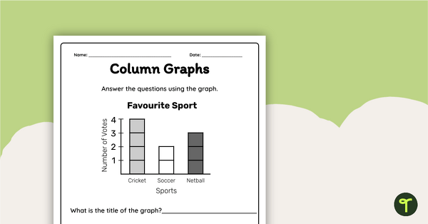
Interpreting a Column Graph Worksheet
Interpret information from a column graph and answer questions with this worksheet.
- Plus Plan
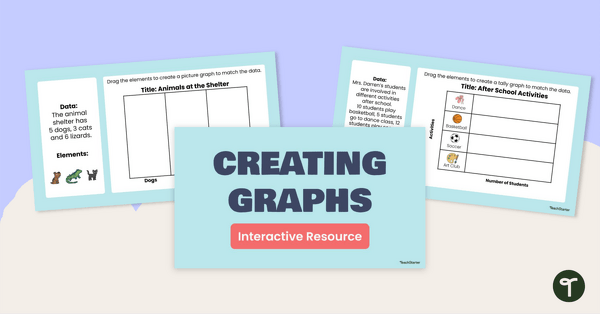
Creating Graphs Interactive Activity
Share this interactive activity with your students to help them practise using digital tools to create graphs from raw data.
- Plus Plan
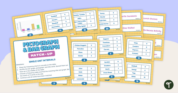
Pictograph and Bar Graph Match-Up (Single-Unit Intervals)
Use data analysis skills to match frequency tables with a corresponding bar graph or pictograph.